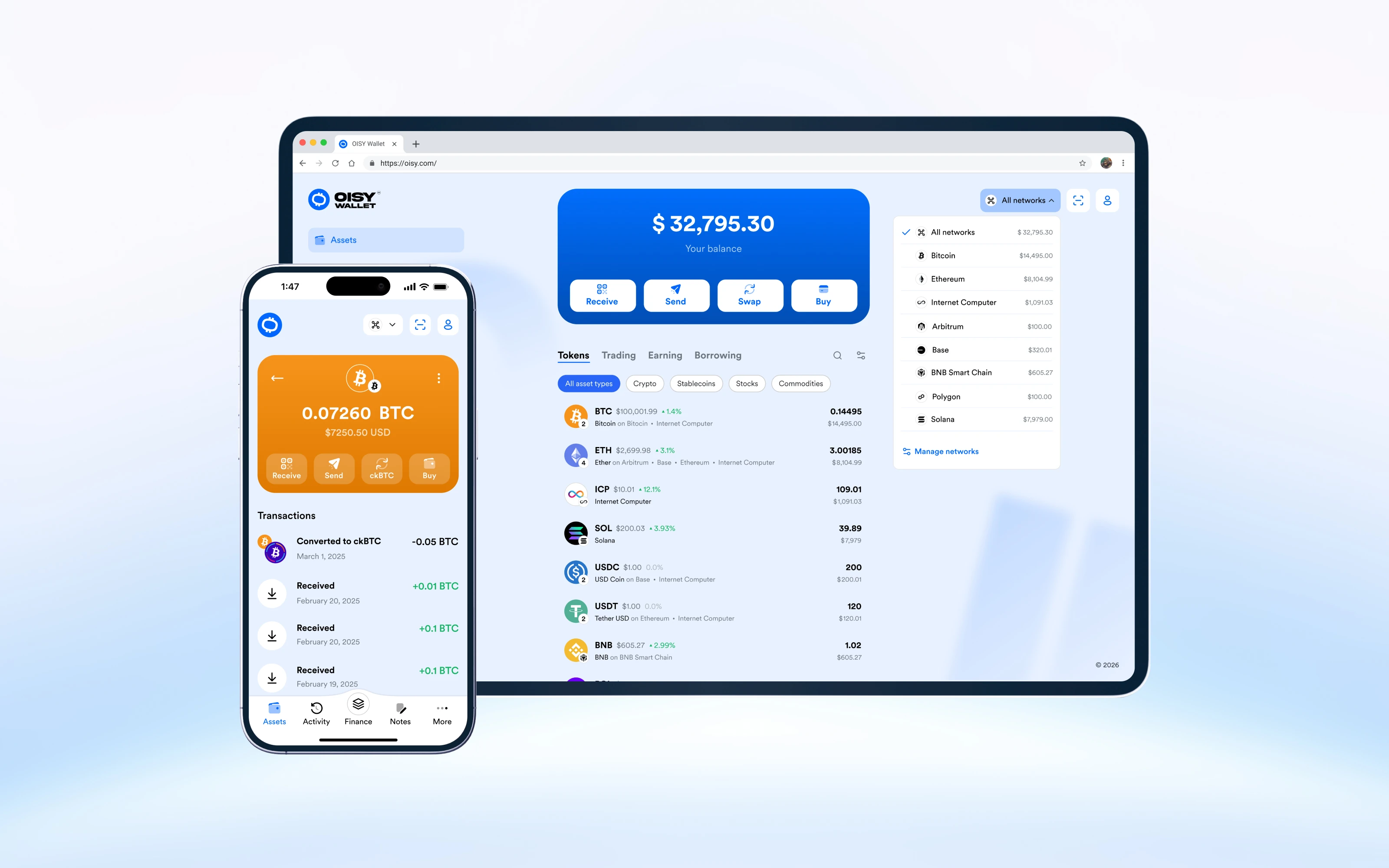
Designing a browser-based, multi-chain wallet
OISY runs entirely on-chain and is served in the browser. People sign in with Internet Identity and passkeys rather than installing an extension or managing a seed phrase. The wallet supports assets across Bitcoin, Ethereum, Solana, ICP, and many other EVM networks.
That setup removes some familiar crypto friction and introduces less familiar behaviour. A conversion can turn ETH into ckETH. A balance can update before its transaction appears in the history. A dApp approval can arrive as a payload few people can read.
My role covered UX, UI, brand application, the design system, and delivery. In a product this technical, design often comes down to deciding which details to show and translating them into what matters to the person making the decision.
Role
Lead product design across product direction, core wallet flows, the UI system, brand application, and design QA.
Team
Product, engineering, marketing, UX research, brand design, support, and leadership.
Product
A responsive, fully on-chain wallet for multi-chain assets, payments, swaps, dApp connections, and signer approvals.
Making technical behaviour understandable
Crypto wallets ask people to make irreversible decisions using unfamiliar language: chains, gas, wrapped assets, approvals, and pending transactions. Experienced users may read that detail as control; newer users often read it as risk.
OISY could keep much of the infrastructure out of view, but hiding it everywhere would create a different problem. When a conversion, delay, or approval goes unexplained, the interface feels unsafe even if the protocol is working as intended.
The goal was to simplify routine actions without removing the details people need to verify them.
My role
Product UX
I mapped and designed onboarding, receive, send, convert, swap, pay, connect, transaction history, and signer flows across desktop and mobile.
UI system
I led the design-system work across the Figma library, shared components, responsive patterns, and interaction states.
Brand and launch
I worked across product UI, brand application, product visuals, templates, motion direction, documentation, and launch assets.
Design operations
I established shared design documentation and processes for intake, planning, reviews, handoff, implementation checks, and design QA.
I worked between leadership, product, and engineering when product decisions depended on protocol or engineering constraints. I reframed feature requests around the user problem, raised feasibility risks early, and checked the implementation through design QA.
Research and product planning
We ran user interviews and usability tests for existing flows and new features. I used those findings, competitive analysis, and detailed customer journey maps in product planning and in the design of individual features.
Reframing the product around user actions
The early product had solid infrastructure and a working prototype, but many interface decisions were still unresolved. Some flows relied on older modal patterns. Transaction and conversion states gave inconsistent feedback. Important changes could happen without enough explanation in the interface.
I used three questions to work through each flow:
- What can the technology do?
- What does the user need to understand before acting?
- What can stay out of view until it matters?
The point was to stop reviewing one screen at a time and define what OISY was for: one place to receive, send, hold, spend, swap, and earn across networks without asking people to reason about the network before every action.
Contacts could work like an address book rather than a key-management tool. Balances could lead with value in the user’s preferred currency. Confirmations could start in plain language, with fees, routes, providers, and transaction records available for verification.
Rules I used when making trade-offs
Start with what someone can do
Explain what a feature lets someone do before explaining Chain Fusion, signer standards, or ledger architecture. Use technical terms when they help someone make a safer decision.
Keep chain details available, not dominant
Organise the main surface around assets, balances, and actions. Show networks, routes, and addresses when they matter for accuracy or troubleshooting.
Always show what happened
Pending, delayed, converted, failed, and partially completed states need explicit UI. A wallet should not leave someone wondering whether their money disappeared.
Treat approvals as security decisions
An approval screen should explain the action, amount, destination or spender, fee, expiry, and risk in language a person can assess.
Building the system around the screens
Requests and user feedback came from several places. The team needed a way to connect them to design decisions and implementation checks.
I led the design-system work beyond individual screens. In Figma, I structured the library around variables, colour tokens, reusable components, shared styles, responsive patterns, and interaction states.
The work also included living design documentation, a Linear board for intake and planning, and shared templates for product and marketing work. Design reviews covered complete flows and states rather than isolated screens. Handoffs included loading, failure, fallback, confirmation, and privacy constraints.
Feedback from support, Discord, email, research, and product analytics went into the same intake and planning process. This kept design from reacting to each request in isolation and gave the teams one place to track the reasoning behind the work.
The shipped product
OISY v1 launched publicly on February 27, 2025. It included passkey authentication, multi-chain asset management, send and receive flows, conversions, swaps, dApp connection, and a more consistent visual system.
Later releases added mobile navigation, more networks, contacts, preferred currency, localisation, NFT support, OISY PAY, AI-assisted actions, and broader swap and Earn surfaces. This was the useful test of the design system: whether it could support new features and networks rather than exist only as documentation in Figma.
The team also had shared principles, reusable components, explicit states, structured intake, closer implementation QA, and feedback loops connected to the backlog.
What I learned
A technically sound wallet can still lose someone’s trust. If people cannot tell what happened to their assets or what they are approving, the interface has failed them.
Much of my work involved moving between protocol capability, engineering constraints, business goals, and the few pieces of information someone needed to take the next step.
If I were setting up this work again, I would define three measures from the start: time to first deposit, success and error rates across money flows, and drop-off inside conversion and approval steps. Those numbers would have made later trade-offs easier to judge.